The Evolution of Responsive Design: Exploring Dynamic Grid Systems
- Post
- August 5, 2023
- HTML & CSS, Responsive Design, Web Development
- 0 Comments
Welcome to the fascinating world of responsive design and dynamic grid systems! In this blog, we delve into the evolutionary journey of these cutting-edge technologies that have revolutionized the way websites adapt to various devices. As a leading SEO and Copywriter, we take you on a journey through the intricate development of responsive design, focusing on responsive CSS media queries and their role in creating mobile-friendly web experiences. So, buckle up as we embark on this informative exploration of the dynamic grid systems that have reshaped the digital realm.
The Emergence of Responsive Design
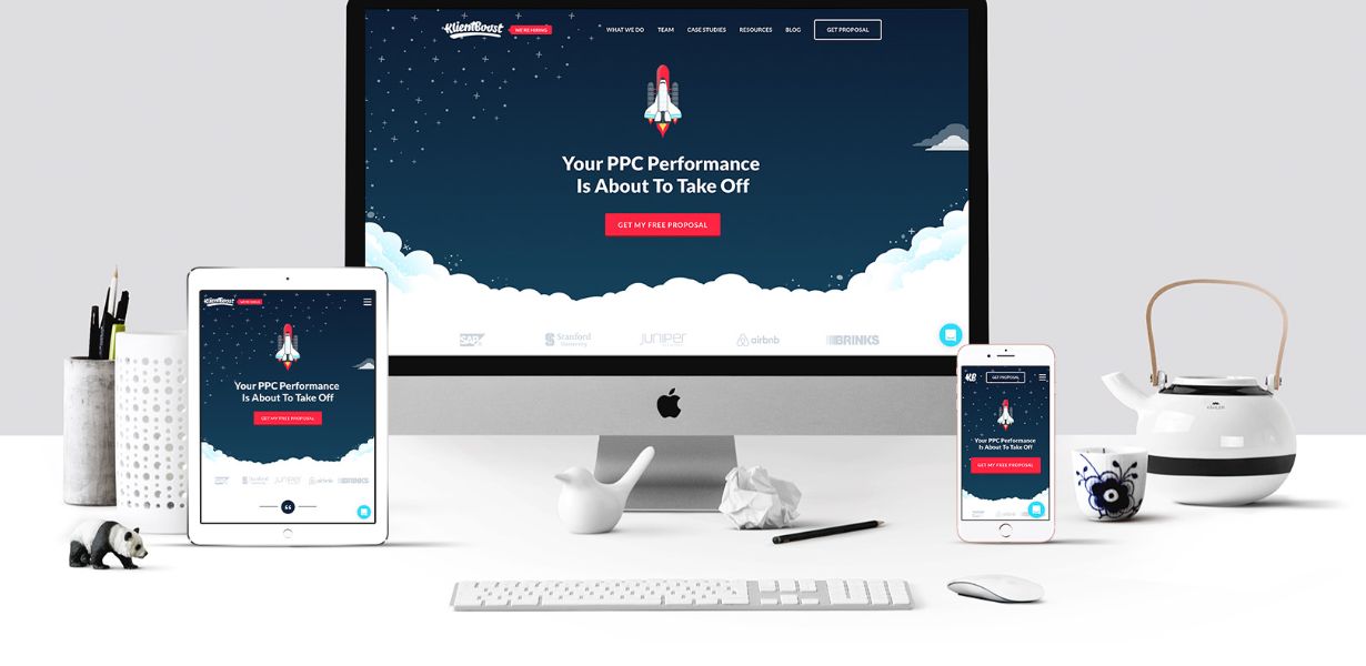
Responsive design, a term coined in the early 2010s, refers to the art of crafting websites that seamlessly adjust to different screen sizes and orientations. Before responsive design, web developers faced the challenge of maintaining separate sites for desktop and mobile users. However, with the advent of smartphones and tablets, the need for a more flexible and adaptable approach became apparent. The concept of responsive design introduced a paradigm shift in web development. It relied on fluid grids, flexible images, and CSS media queries to create a single, all-encompassing design that responds dynamically to the user’s device. This evolution significantly improved the user experience and paved the way for a mobile-first approach in website development.
Understanding Dynamic Grid Systems
At the core of responsive design lies the dynamic grid system – a powerful mechanism that allows websites to arrange content in a fluid manner. Unlike the rigid layouts of the past, dynamic grids adapt and rearrange elements based on the available screen space. Dynamic grid systems employ CSS media queries to detect the user’s device dimensions and adjust the layout accordingly. This responsive CSS media query magic enables websites to deliver a seamless experience across a wide range of devices, from large desktop screens to small smartphones.
The Impact on Mobile User Experience
Mobile devices have become the primary means of accessing the internet for a significant portion of users. Responsive design’s adoption has led to a dramatic improvement in the mobile user experience, reducing bounce rates and increasing user engagement. With dynamic grid systems, websites load faster on mobile devices, contributing to improved search engine rankings and higher conversions. A seamless transition from one device to another keeps users immersed in the content, promoting positive brand experiences.
The Role of CSS Media Queries
CSS media queries form the backbone of responsive design and dynamic grid systems. They enable web developers to apply specific styles based on the user’s device characteristics. By utilizing media queries effectively, websites can target screens of varying sizes, resolutions, and orientations. Responsive CSS media queries facilitate the fluidity of elements, ensuring text, images, and videos resize proportionally to fit the screen. As a result, content remains legible and visually appealing, irrespective of the device being used.
Best Practices for Implementing Responsive Design
To ensure the successful implementation of responsive design and dynamic grid systems, web developers must adhere to best practices. Here are some key tips:
Prioritize a mobile-first approach during website development.
Use relative units like percentages and ems instead of fixed units for sizing elements.
Optimize images to reduce loading times on mobile devices.
Test thoroughly across various devices and browsers to ensure consistent performance.
Future Trends and Innovations
As technology continues to evolve, so will the world of responsive design. Anticipate exciting advancements like:
Integration of Artificial Intelligence (AI) for personalized user experiences.
Greater focus on accessibility for users with disabilities.
Incorporation of new design paradigms like Augmented Reality (AR) and Virtual Reality (VR).
Final Words
In conclusion, the evolution of responsive design and dynamic grid systems has transformed the way we experience the web. From the early days of fixed layouts to the fluidity of today’s designs, the journey has been remarkable. Responsive CSS media queries have been instrumental in creating mobile-friendly experiences that engage and delight users. As we look to the future, the possibilities for further innovation in web design are endless. Embrace the power of responsive design and take your website to new heights in this dynamic digital landscape.
Commonly Asked Questions
Q1. What is the primary goal of responsive design?
A1. The primary goal of responsive design is to create websites that adapt seamlessly to various screen sizes and devices, providing an optimal user experience.
Q2. How do CSS media queries contribute to responsive design?
A2. CSS media queries allow web developers to apply specific styles based on the user’s device characteristics, enabling dynamic adjustments of content to fit different screens.
Q3. Why is mobile-friendly design crucial for websites?
A3. Mobile-friendly design is essential because an increasing number of users access the internet through mobile devices. It improves user experience, search engine rankings, and conversion rates.
Q4. How does a mobile-first approach benefit responsive design?
A4. A mobile-first approach ensures that websites are initially designed for mobile devices and then progressively enhanced for larger screens, resulting in better adaptability and performance.
Q5. What future trends can we expect in responsive design?
A5. The future of responsive design may witness AI-driven personalization, increased accessibility focus, and the integration of innovative design technologies like AR and VR.