Revolutionizing User Experience with Media Queries 2.0: Dynamic Adaptability for a Multi-Device World
- Post
- August 7, 2023
- Media Queries, Mobile & Responsive, Web Design
- 0 Comments
In this blog, we delve into the exciting world of Media Queries 2.0 and how they are revolutionizing user experience in a multi-device world. Media Queries, a fundamental concept in CSS, have evolved to ensure dynamic adaptability across a wide range of devices, from mobile phones to large desktop screens. As user behavior continues to shift towards mobile and diverse screen sizes, it becomes imperative for web developers to adopt this new approach to create seamless and responsive designs.
Understanding Media Queries CSS
Media Queries CSS is a technique that allows developers to apply specific CSS rules based on the characteristics of the device or browser used to access the website. By using this technology, developers can tailor the website’s layout, font sizes, and other design elements to provide an optimal viewing experience. Media Queries are written in CSS and use conditional statements to target devices that meet certain criteria, such as screen width, height, resolution, and orientation.
One of the main benefits of Media Queries is that they help create a single codebase that adapts to different devices, rather than building separate websites for each screen size. This not only simplifies maintenance but also enhances the overall user experience.
Media Queries Breakpoints
Media Queries breakpoints are the specific screen widths at which the website’s layout and design elements change to adapt to different devices. These breakpoints are strategically set to ensure a smooth transition between different screen sizes. Designers and developers must carefully choose breakpoints to deliver a seamless experience across a wide range of devices.
Common Media Queries breakpoints include:
Small screens (e.g., mobile phones): 320px to 480px
Medium screens (e.g., tablets): 481px to 768px
Large screens (e.g., laptops and desktops): 769px to 1024px
Extra-large screens (e.g., large desktops): 1025px and above
By incorporating these breakpoints, websites can gracefully adjust their layout, images, and font sizes, providing users with an intuitive and visually pleasing experience on any device.
Media Queries for All Devices
Media Queries enable developers to craft a responsive design that caters to all devices, irrespective of their size and capabilities. With this approach, websites can automatically adapt to the user’s device, making it accessible to a broader audience.
Here are some best practices for implementing Media Queries for all devices:
Use relative units: Employ relative units like “em” and “rem” instead of fixed pixel values to ensure scalability across different screen sizes.
Test on real devices: Always test the website on various devices to ensure that it performs optimally across all platforms.
Optimize images: Utilize responsive images and optimize them for different screen resolutions to reduce load times.
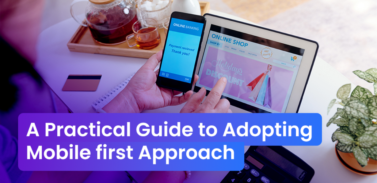
Mobile-first approach: Start with the mobile version of the website and progressively enhance the design for larger screens.
Harnessing the Power of Media Queries 2.0
Media Queries 2.0 introduces new features that enhance the flexibility and adaptability of websites even further. Some key features include:
Aspect Ratio Media Features
Aspect Ratio Media Features allow developers to style elements based on the aspect ratio of the screen. This is particularly useful for designing user interfaces that are not solely dependent on screen width but also on the overall aspect ratio of the device.
Color-Gamut Media Feature
With the Color-Gamut Media Feature, websites can detect the device’s color capabilities and provide appropriate color profiles. This ensures that the website’s design remains consistent and visually appealing, regardless of the device’s color capabilities.
Hover Media Feature
The Hover Media Feature helps differentiate touch-enabled and non-touch devices. This feature enables developers to provide unique hover effects for mouse users while ensuring that touch users have a smooth and intuitive experience.
Final Words
In a multi-device world, a rich user experience is non-negotiable. Users expect seamless transitions, intuitive layouts, and visually pleasing designs across all devices. Media Queries 2.0 empowers developers to create dynamic adaptability, catering to the diverse needs of modern users. By leveraging the potential of Media Queries, websites can stand out in the competitive digital landscape and leave a lasting impression on their visitors.
Commonly Asked Questions
Q1. How do Media Queries enhance website performance?
Media Queries optimize website performance by loading only the necessary styles and assets based on the user’s device characteristics. This reduces page load times and improves the overall browsing experience.
Q2. Are Media Queries compatible with older browsers?
Most modern browsers support Media Queries, but older versions might have limited support. To ensure compatibility, developers can use polyfills or fallback stylesheets for older browsers.
Q3. Can I use Media Queries for email templates?
Yes, you can use Media Queries for responsive email templates. However, bear in mind that some email clients might have limited support for certain Media Queries features.
Q4. How frequently should I update Media Queries breakpoints?
Media Queries breakpoints should be updated whenever there are significant changes in device usage trends or when launching new devices with unique screen sizes. Regularly monitor website analytics to identify opportunities for improvement.
Q5. Can Media Queries replace responsive design frameworks?
While Media Queries are a fundamental aspect of responsive design, they do not replace responsive design frameworks entirely. Frameworks like Bootstrap and Foundation provide a solid foundation for building responsive websites quickly and efficiently.


