Revolutionizing UI Development: Flexbox vs. Grid – A Comparative Guide
- Post
- August 5, 2023
- Flexbox, HTML & CSS, Web Development
- 0 Comments
In the fast-evolving world of web development, the way we create user interfaces has transformed significantly. Gone are the days of relying solely on float-based layouts. With the introduction of Flexbox and Grid, we now have powerful tools to structure our web elements effortlessly, bringing a new level of responsiveness and consistency to our designs.
Understanding Flexbox: The Flexible Box Model
What is Flexbox?
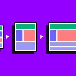
Flexbox, short for Flexible Box Layout, is a one-dimensional layout model that allows you to distribute space among items within a container. It’s designed to handle dynamic and flexible UI components, making it ideal for handling complex layouts with varying content sizes.
Key Features of Flexbox
Flexbox offers a range of powerful features, including:
Flex Containers and Items:
The container becomes a flex container, and its direct children become flex items.
Flex Direction:
Define the direction of flex items within the container, either in rows or columns.
Flex Wrapping:
Control whether flex items should wrap to a new line or stay in a single line.
Flex Justify Content:
Align flex items along the main axis.
Flex Align Items:
Align flex items along the cross axis.
Use Cases of Flexbox
Flexbox excels in scenarios such as:
Navigation bars
Equal height columns
Centering elements vertically and horizontally
Complex forms
To add credibility, the official documentation of CSS-Tricks can be referenced.
Unleashing the Power of Grid Layout
What is Grid?
CSS Grid Layout, commonly known as Grid, is a two-dimensional layout system that brings the concept of grid-based design to CSS. It allows you to create both rows and columns, giving you precise control over the layout and alignment of elements.
Key Features of Grid
Grid provides powerful features like:
Grid Template Columns and Rows: Define the size and number of columns and rows in the grid.
Grid Gap: Set the space between grid cells.
Grid Areas: Assign names to specific areas in the grid for better organization.
Grid Align Items: Align grid items along the block (column) axis.
Grid Justify Items: Align grid items along the inline (row) axis.
Use Cases of Grid
Grid is an excellent choice for:
Complex page layouts
Magazine-style designs
Image galleries
Masonry layouts
To validate the information, Mozilla Developer Network (MDN) can be cited as a reputable source.
Flexbox vs. Grid: Making the Right Choice
Flexbox or Grid – Which One to Choose?
The decision between Flexbox and Grid depends on the specific requirements of your web layout. Let’s compare them in various aspects to help you make an informed choice:
Dimensionality:
Flexbox: One-dimensional, ideal for layouts in a single direction.
Grid: Two-dimensional, perfect for complex layouts with both rows and columns.
Content Ordering:
Flexbox: Reordering of items is more straightforward with the order property.
Grid:
Allows reordering of items using line-based placement.
Alignment:
Flexbox: Provides flexible alignment options along the main axis and cross axis.
Grid: Offers precise alignment control for both rows and columns.
Nested Layouts:
Flexbox: Well-suited for handling nested elements with its unique item flow.
Grid: Efficiently handles complex nested layouts.
Browser Support:
Flexbox: Good support in modern browsers but may require vendor prefixes in some cases.
Grid: Widely supported, including most modern browsers and IE 11+.
It’s essential to consider your project’s specific layout requirements and browser compatibility to make an informed decision.
Making the Transition: Combining Flexbox and Grid
Both Flexbox and Grid have their strengths and can complement each other effectively. In many cases, combining these layout models can lead to even more powerful and flexible web designs. Here are some tips for using them together:
Use Flexbox within Grid Items:
Apply Flexbox to individual grid items for additional alignment and flexibility within specific sections of the grid.
Nested Grids:
Utilize grids inside Flex containers to create complex, nested layouts that can adapt to various screen sizes.
Flexbox for Navigation Elements:
For navigation menus and UI components requiring dynamic spacing, consider using Flexbox.
Grid for Overall Page Structure:
Implement Grid for the overall page layout, setting up rows and columns to create a solid foundation.
Final Words
In conclusion, both Flexbox and Grid are powerful tools that revolutionize UI development. Flexbox shines in handling one-dimensional layouts, while Grid excels at two-dimensional arrangements. Choose Flexbox for simpler, linear layouts and opt for Grid when dealing with complex designs involving both rows and columns. For the ultimate control over your web interfaces, consider combining both layout models strategically.
Frequently Asked Questions
Q1. Is Flexbox Better Than Grid?
Both Flexbox and Grid serve different purposes, and one isn’t inherently better than the other. The choice depends on the specific layout requirements of your web project.
Q2. Can I Use Flexbox and Grid Together?
Absolutely! In fact, combining Flexbox and Grid can be a powerful approach to achieve flexible and intricate web layouts.
Q3. Which Browsers Support Flexbox and Grid?
Flexbox is well-supported in modern browsers, but older versions may require vendor prefixes. Grid is widely supported, including modern browsers and IE 11+.
Q4. What Are Some Common Flexbox Use Cases?
Flexbox is great for creating navigation bars, equal height columns, centering elements, and handling complex forms.
Q5. When Should I Use Grid Layout?
Grid is ideal for designing complex page layouts, magazine-style designs, image galleries, and masonry layouts.