Revolutionary Mobile-First Design: Foldable Devices and Multitasking Magic
- Post
- August 7, 2023
- Mobile & Responsive, Mobile-First Design, Web Design
- 0 Comments
In today’s fast-paced digital world, mobile devices have become an integral part of our lives. From smartphones to tablets, these devices have revolutionized how we interact with technology. However, the emergence of foldable devices takes this revolution to a whole new level, offering users an innovative and immersive experience like never before. In this blog, we will delve into the exciting realm of foldable devices and explore the magic of multitasking that comes with them. Join us as we unravel the wonders of mobile-first design, examining examples, templates, and the approach that drives this groundbreaking technology.
Understanding Mobile-First Design
Mobile-first design is a user-centric approach that prioritizes designing for mobile devices before considering the desktop version. It acknowledges the rising trend of mobile device usage and ensures that websites and applications are optimized for smaller screens and touch interactions. By putting mobile users first, businesses can enhance user experience, increase engagement, and boost conversions.
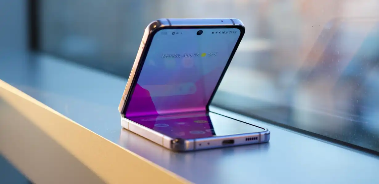
Unfolding the World of Foldable Devices
Foldable devices, as the name suggests, can be folded or unfolded, transforming between phone and tablet modes. This innovation combines the portability of a smartphone with the larger display of a tablet, offering users a versatile and seamless experience. Brands like Samsung, Huawei, and Motorola have taken the lead in creating foldable smartphones that cater to the needs of multitasking enthusiasts.
Embracing Multitasking Magic
Multitasking on foldable devices takes on a whole new meaning. With the ability to split the screen and run multiple apps simultaneously, users can boost productivity and efficiency. Imagine browsing the web on one half of the screen while taking notes on the other, or watching a video while responding to messages – all without having to switch between apps constantly.
Mobile-First Design Examples
Let’s explore some inspiring mobile-first design examples that showcase how businesses leverage this approach to create exceptional user experiences:
Airbnb’s Mobile App – The Airbnb app ensures a seamless booking experience with its mobile-first design, allowing users to browse, book, and manage their reservations effortlessly.
Google Maps – Google Maps adopts a mobile-first design to provide users with a user-friendly interface that simplifies navigation and exploration on smaller screens.
Mobile-First Design Templates
Designing for mobile-first doesn’t mean starting from scratch. Several templates cater to this approach, making it easier for designers to create captivating and functional interfaces:
E-commerce Template – Ideal for online stores, this template focuses on easy navigation, quick checkout, and mobile-friendly product displays.
News and Blog Template – With a strong emphasis on readability and legibility, this template enhances the reading experience on mobile devices.
The Mobile-First Design Approach
To execute a successful mobile-first design, certain principles and best practices should be followed:
Content Prioritization – Identify the most critical content and features and ensure they take precedence on smaller screens.
Responsive Testing – Conduct rigorous testing across various devices to guarantee a seamless experience for all users.
Overcoming Challenges in Foldable Devices
While foldable devices bring forth exciting possibilities, there are some challenges that designers and developers must address:
App Adaptation – Apps need to be optimized for both folded and unfolded states to avoid glitches and maintain continuity.
UI/UX Consistency – Achieving a consistent user experience across different screen sizes and orientations requires careful planning.
Final Words
In conclusion, mobile-first design and foldable devices are shaping the future of user experiences. As technology continues to evolve, it is crucial for businesses to adapt and embrace these innovations to stay relevant and provide their users with the best possible interactions. By incorporating mobile-first design principles, leveraging foldable devices, and maximizing the magic of multitasking, businesses can elevate their digital presence and leave a lasting impact on their users.
Commonly Asked Questions
Q1. How do foldable devices improve multitasking?
Foldable devices enable multitasking by allowing users to run multiple apps simultaneously on split screens. This feature enhances productivity and efficiency, making it easier to juggle multiple tasks effortlessly.
Q2. Can I use existing templates for mobile-first design?
Yes, several mobile-first design templates are readily available, catering to various industries and purposes. These templates serve as a starting point for designers and can be customized to suit specific branding and functional requirements.
Q3. What are the benefits of mobile-first design for businesses?
Mobile-first design offers several benefits, including improved user experience, increased mobile traffic, higher search engine rankings, and better conversion rates. By prioritizing mobile users, businesses can tap into a larger audience and stay ahead of the competition.
Q4. Are foldable devices durable and long-lasting?
Foldable devices are engineered with robust materials and technologies to ensure durability. Manufacturers conduct rigorous tests to guarantee the reliability and longevity of these devices, making them suitable for everyday use.
QRevolutionary Mobile-First Design: Exploring Foldable Devices5. How can businesses adapt to the foldable device trend?
Businesses can adapt to the foldable device trend by optimizing their websites and applications for foldable screens, conducting usability testing, and keeping track of evolving technologies to incorporate innovative features and experiences.


