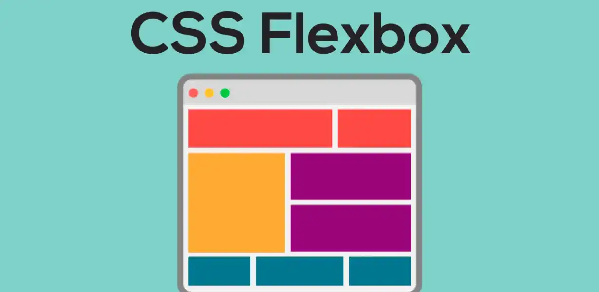
Flexbox Hacks and Best Practices for Supercharging Your Web Design
- Post
- August 5, 2023
- Flexbox, HTML & CSS, Web Development
- 0 Comments
In today’s digital landscape, web design plays a crucial role in creating an engaging user experience. Flexbox, a powerful CSS layout model, has revolutionized the way we design websites. With its flexible and responsive features, it offers a plethora of hacks and best practices to take your web design to the next level. In this comprehensive guide, we’ll delve into the world of Flexbox, exploring its properties, and providing you with invaluable insights to optimize your web design. Let’s dive in and supercharge your design!
Understanding Flexbox CSS
Before we dive into the hacks and best practices, let’s first understand what Flexbox CSS is. Flexbox is a layout model that allows you to design flexible and responsive web layouts with ease. It operates on a parent-child relationship, where the parent element becomes a flex container, and the child elements within it become flex items. By defining flex containers and flex items, you can control the alignment, distribution, and order of elements, all while maintaining a dynamic and fluid design.
Key Properties of Flexbox
To harness the full potential of Flexbox, you need to grasp its key properties. Let’s explore some of the most essential ones:
Setting Up the Flex Container
To initiate the magic of Flexbox, you need to declare the parent element as a flex container. By using the display: flex; property, you establish a flex formatting context, enabling Flexbox features for its child elements.
Directing the Flex Layout
This property allows you to define the direction in which flex items flow within the container. Options include row, column, row-reverse, and column-reverse, providing unparalleled control over the layout.
Controlling Item Wrapping
With flex-wrap, you can control how flex items wrap within the container when there isn’t enough space. Options like nowrap, wrap, and wrap-reverse come in handy when dealing with various screen sizes.
Expanding Flex Items
By using flex-grow, you can specify how flex items grow to fill the available space. Assigning a higher value to a flex item will make it expand more, allowing for dynamic distribution.
Shrinking Flex Items
Conversely, flex-shrink allows you to control how flex items shrink when the container’s space is limited. You can allocate higher values to items you want to shrink first, preserving the design’s integrity.
Setting the Default Size
Using flex-basis, you can set the initial size of flex items before the available space is distributed. This helps in creating predictable layouts and preventing unexpected resizing.
Leveraging Flexbox for Responsive Web Design
One of Flexbox’s biggest advantages lies in its ability to handle responsive web design effortlessly. Here are some practical tips to ensure your design looks stunning on all devices:
Embrace Media Queries
Utilize media queries to target specific screen sizes and adapt the flex layout accordingly. By adjusting the flex properties based on screen width, you can create a seamless experience for users on various devices.
Master the align-items and justify-content
align-items and justify-content are powerful properties that control the alignment of flex items within the container. Mastering these properties allows you to precisely position elements on the screen, catering to diverse design requirements.
Use Flexbox for Navigation Menus
Creating responsive navigation menus is a breeze with Flexbox. By organizing navigation elements in a flex container, you can easily control their spacing, alignment, and order on different devices.
Create Equal Height Columns
A common challenge in web design is achieving equal height columns. With Flexbox, you can say goodbye to complex CSS hacks and effortlessly create columns of equal height, enhancing the visual appeal of your website.
Common Pitfalls to Avoid
While Flexbox is a powerful tool, it’s essential to be mindful of potential pitfalls that might hinder your design. Here are a few common mistakes to avoid:
Nested Flex Containers
Avoid unnecessary nesting of flex containers, as it can lead to complex layouts and impact performance. Instead, try to keep your flex hierarchy as flat as possible.
Overusing Flexbox
While Flexbox offers numerous advantages, it’s not always the best solution for every layout. For simpler designs, traditional CSS might be more efficient.
Ignoring Browser Compatibility
Although Flexbox is well-supported, always test your design on various browsers to ensure a consistent user experience.
Final Words
In conclusion, mastering Flexbox hacks and best practices is essential for supercharging your web design. By understanding the core properties and leveraging Flexbox for responsive layouts, you can create visually stunning and user-friendly websites. Embrace the flexibility of Flexbox, and watch your web designs flourish across all devices.
Commonly Asked Questions
Q1. Is Flexbox suitable for complex layouts?
Absolutely! Flexbox is excellent for both simple and complex layouts. Its flexibility and versatility make it a valuable tool for handling various design requirements.
Q2. Can I use Flexbox with CSS Grid?
Yes, you can combine Flexbox and CSS Grid to create powerful layouts. CSS Grid is ideal for two-dimensional layouts, while Flexbox shines in one-dimensional arrangements.
Q3. Are there any browser compatibility issues with Flexbox?
While most modern browsers support Flexbox, it’s essential to test your designs on older browsers to ensure compatibility. Consider using vendor prefixes for broader support.
Q4. Does Flexbox replace traditional CSS layout methods?
Flexbox complements traditional CSS layout methods but doesn’t entirely replace them. For simpler designs, using traditional methods might be more efficient.
Q5. Can I animate Flexbox properties?
Yes, you can animate Flexbox properties using CSS transitions or animations. This allows you to add dynamic effects to your layout and create engaging user experiences.