Dark Mode Design: Crafting Aesthetically Pleasing Interfaces with the Psychology of Color
- Post
- August 7, 2023
- Dark Mode, Web Design, Web Design Trends
- 0 Comments
Dark mode has become a popular design trend in recent years, transforming the way we interact with digital interfaces. The concept of dark mode revolves around using a dark color scheme, predominantly black or dark gray, instead of the traditional light backgrounds. It not only enhances the overall user experience but also offers numerous benefits such as reduced eye strain, improved battery life on certain devices, and a more sophisticated appearance.
The Psychology of Dark Mode
Dark Mode: A Visual Delight
Dark mode captivates users with its modern and sleek appearance, creating an aura of elegance and sophistication. The color psychology behind dark mode reveals that black exudes a sense of power, mystery, and formality, while dark grays induce a calming effect, promoting a focus on content. This intriguing combination makes dark mode an ideal choice for applications and websites aiming to provide a visually delightful experience.
Reducing Eye Strain: A Pleasing Experience
One of the primary reasons for the growing popularity of dark mode is its ability to reduce eye strain, especially in low-light environments. By reducing the contrast between the text and the background, dark mode lessens the strain on the eyes, resulting in a more comfortable browsing experience. Users can spend extended periods without feeling fatigued, making it an attractive feature for late-night readers and professionals who work long hours on their devices.
The Technical Aspects of Dark Mode Design
Implementing Dark Mode Responsively
When designing for dark mode, it is crucial to ensure responsiveness across various devices and platforms. CSS media queries play a vital role in detecting the user’s preference for dark mode and automatically adjusting the interface accordingly. By employing the prefers-color-scheme media query, designers can seamlessly switch between light and dark themes based on the user’s operating system settings, creating a consistent user experience.
Choosing the Right Colors: Contrast and Consistency
While crafting interfaces in dark mode, designers must focus on choosing colors that offer optimal contrast and maintain brand consistency. Utilizing white or other bright colors for text, buttons, and icons helps create the necessary contrast against the dark background, ensuring readability and accessibility. Maintaining brand consistency with the chosen color palette is equally important, as it reinforces the user’s association with the brand.
Chrome Dark Mode: Harnessing the Power of Google’s Ecosystem
Embracing Chrome’s Dark Mode
With Google Chrome’s increasing popularity, it is essential for designers to understand and leverage its dark mode capabilities. Chrome’s dark mode extends to websites that have been coded with proper dark mode support. By making use of the ‘prefers-color-scheme’ media query in CSS, developers can adapt their websites to complement Chrome’s dark mode, providing users with a seamless and visually pleasing experience.
User Experience Benefits: A Seamless Transition
Enabling dark mode in websites optimizes the user experience, as it allows users to transition effortlessly between dark mode and the default light mode, depending on their device settings. This adaptability ensures that users can enjoy the benefits of dark mode across various platforms, resulting in higher user satisfaction and engagement.
Dark Mode Websites: The Art of Balance
Striking the Perfect Balance
While designing dark mode websites, achieving the right balance between aesthetics and functionality is crucial. Employing contrasting colors, distinct typography, and clear visual hierarchy enhances the user experience and prevents the interface from feeling overwhelming. Striking this balance not only elevates the design but also ensures that the website remains accessible to a wider audience.
Dark Mode and Branding: Reinforcing Identity
Dark mode offers a unique opportunity to reinforce a brand’s identity and create a memorable user experience. Customizing brand elements, such as logos and icons, to fit the dark color scheme strengthens brand recognition and makes the website stand out in a sea of competitors.
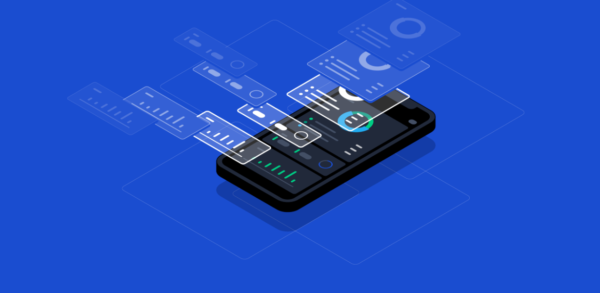
Designing Dark Mode for Mobile Applications
Dark Mode on Mobile: A User-Centric Approach
Incorporating dark mode into mobile applications requires thoughtful consideration of user preferences and app functionalities. The mobile interface must adapt seamlessly to dark mode, offering a visually appealing experience without compromising on usability. Designers should focus on optimizing touch targets, ensuring readability, and preserving the app’s core features.
Battery Life Benefits: Prolonged Usage
For users who spend significant time on their mobile devices, dark mode offers an additional advantage – improved battery life. Mobile devices with OLED or AMOLED displays consume less power when displaying dark pixels. Therefore, enabling dark mode in mobile applications can lead to longer battery life and improved user satisfaction.
Common Misconceptions and Best Practices
Myth Busting: Dark Mode and OLED Displays
One common misconception is that dark mode always saves battery life on all devices, especially those with OLED displays. While this is true to some extent, it is essential to recognize that LCD displays do not experience the same battery-saving benefits in dark mode. Therefore, designers should consider the device type when implementing dark mode for their applications and websites.
Accessibility: The Importance of Contrast
When designing interfaces in dark mode, ensuring proper color contrast is critical for accessibility. Designers should conduct thorough contrast checks to comply with accessibility guidelines, making the content easily readable for users with visual impairments.
Final Words
In conclusion, dark mode design presents a compelling opportunity to create aesthetically pleasing interfaces that cater to user preferences and enhance the overall user experience. By leveraging the psychology of color and adhering to best design practices, designers can craft sophisticated, visually delightful, and user-centric interfaces that seamlessly adapt to different platforms.
Frequently Asked Questions
1. Why is dark mode becoming increasingly popular in web design?
The growing popularity of dark mode can be attributed to its modern and elegant appearance, reduced eye strain, improved battery life on certain devices, and enhanced readability in low-light conditions.
2. How can dark mode benefit mobile applications?
Dark mode in mobile applications not only offers a visually appealing experience but also prolongs battery life, making it an ideal choice for users who spend significant time on their mobile devices.
3. Is dark mode suitable for all types of displays?
While dark mode is beneficial for devices with OLED or AMOLED displays, it may not necessarily save battery life on LCD displays. Designers should consider the device type when implementing dark mode.
4. How does dark mode impact brand identity?
Dark mode provides a unique opportunity to reinforce brand identity by customizing brand elements to fit the dark color scheme, increasing brand recognition and user engagement.
5. What are some best practices for designing in dark mode?
Designers should focus on employing proper color contrast, maintaining brand consistency, and ensuring responsiveness across devices to create visually pleasing and accessible dark mode interfaces.