Dark Mode Delight: Deciphering the Science and Advantages of Dark UI Design
- Post
- August 7, 2023
- Front-End Frameworks, UI/UX Design, Web Development
- 0 Comments
In the digital age, where user interfaces reign supreme, the design landscape has undergone a transformative shift. Dark mode, an ingenious UI/UX framework, has emerged as a compelling design trend, captivating users with its aesthetic appeal and practical benefits. In this exploration, we delve into the realm of dark UI design, unraveling its scientific underpinnings and unveiling the myriad advantages it brings to the table.
Illuminating the Dark Mode Phenomenon
Shedding Light on Dark UI Design
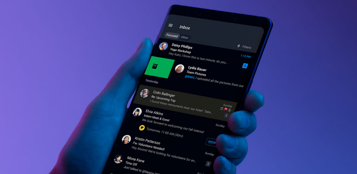
Dark mode, an alternative color scheme for user interfaces, inverts the traditional light-on-dark layout to dark-on-light. This shift not only provides a visually striking contrast but also holds a scientific rationale. Research indicates that dark UI design reduces eye strain and enhances visual ergonomics, particularly in low-light environments. The reduction in blue light emission from screens during dark mode usage contributes to alleviating digital eye fatigue.
The Science Behind Dark Mode
The science supporting dark mode revolves around the way human eyes perceive light. The eye’s pupil dilates in response to darkness, allowing more light to enter. In bright environments, pupils constrict, reducing the amount of light that reaches the retina. Dark mode adapts to these physiological responses, ensuring optimal visual comfort by adjusting screen brightness to external lighting conditions.
Unveiling the Benefits of Dark UI Design
Energy Efficiency and Extended Battery Life
Embracing dark mode isn’t just a visual treat; it’s an energy-efficient choice. Dark interfaces consume significantly less power on devices with OLED and AMOLED screens, as these pixels emit light individually. Subsequently, battery life is extended, a boon for mobile users seeking prolonged device usage.
Enhanced Visual Focus and Content Legibility
Dark UI design empowers users to focus on content by reducing the glare that accompanies traditional bright layouts. This enhanced focus translates into improved reading experiences, as text and visuals stand out crisply against dark backgrounds. Moreover, dark mode facilitates a sense of hierarchy, guiding users’ attention to essential elements.
Alleviating Screen Glare and Eye Strain
By embracing dark mode, users bid adieu to the discomfort caused by screen glare. The soft contrast between text and background minimizes the intensity of light reflected off the screen, alleviating eye strain and making prolonged interactions more comfortable.
Mitigating Sleep Disruption
Modern lifestyles often involve extended screen time, especially during evening hours. Dark UI design can play a pivotal role in mitigating sleep disruption caused by excessive exposure to blue light. By reducing blue light emission, dark mode encourages the production of melatonin, the sleep-inducing hormone, facilitating more restful sleep patterns.
Aesthetic Sophistication and Personalization
Dark mode isn’t merely a pragmatic choice; it’s an embodiment of aesthetic sophistication. With its sleek and modern allure, dark UI design adds a touch of elegance to interfaces. Furthermore, the personalization aspect cannot be ignored. Dark mode allows users to tailor their digital experiences to align with their preferences and sensibilities.
Navigating the Implementation of Dark UI Design
Adapting Existing Interfaces
Integrating dark mode into an existing UI requires a thoughtful approach. Designers must consider the harmonious transition of colors, contrasts, and visual elements to ensure a seamless experience for users. A comprehensive understanding of color theory and user behavior is imperative to execute this transformation effectively.
Leveraging UI/UX Frameworks for Dark Mode
As the demand for dark mode intensifies, UI/UX frameworks have risen to the occasion. These frameworks offer pre-designed components and guidelines that streamline the integration of dark UI design. Leading frameworks such as Material Design, Bootstrap, and Semantic UI provide robust tools for developers to implement dark mode effortlessly.
Striking the Right Balance: Contrast and Readability
While the allure of dark UI design is undeniable, designers must prioritize readability. Optimal contrast between text and background, along with careful selection of typography, ensures that content remains legible. The harmony between aesthetics and usability is key to a successful dark mode implementation.
Final Words
In the dynamic landscape of UI/UX design, dark mode has emerged as a shining star, offering a harmonious blend of visual elegance and functional superiority. Backed by scientific insights and laden with benefits, dark UI design transcends aesthetic appeal, ushering in a new era of digital interaction that caters to user comfort and preference.
Commonly Asked Questions
Q1: Does dark mode affect battery life on all devices?
A1: Dark mode significantly conserves energy on devices with OLED and AMOLED screens, leading to extended battery life. However, its impact on traditional LCD screens is less pronounced.
Q2: Can dark mode reduce the risk of digital eye strain?
A2: Yes, dark mode’s reduced blue light emission contributes to alleviating digital eye strain, especially during low-light conditions.
Q3: Is dark mode suitable for all types of content?
A3: Dark mode is versatile and can enhance the legibility of various content types. However, its effectiveness depends on proper contrast and typography choices.
Q4: How can I implement dark mode on my website or app?
A4: To implement dark mode, leverage UI/UX frameworks that offer dedicated components and guidelines. Adapting existing interfaces requires an understanding of color theory and user preferences.
Q5: Does dark mode positively impact sleep patterns?
A5: Yes, by reducing blue light emission, dark mode can aid in promoting healthier sleep patterns, especially when interacting with screens before bedtime.