Creating Stunning and Customizable UIs with Material UI Theming
- Post
- August 5, 2023
- Front-End Frameworks, Material UI, Web Development
- 0 Comments
In the realm of modern web development, crafting visually appealing and highly functional user interfaces (UIs) is an art form. Material UI, with its intuitive design principles and comprehensive toolkit, has emerged as a powerful tool for developers seeking to create stunning and customizable UIs. In this blog, we delve into the world of Material UI theming, exploring how it empowers developers to breathe life into their design visions and elevate user experiences.
Understanding Material Design and Material UI
Material Design: At the core of Material UI theming lies the concept of Material Design. Developed by Google, Material Design is a design language that focuses on creating a consistent, tangible, and realistic visual language. It emphasizes the use of tactile and visual cues, such as shadows and depth, to create a sense of hierarchy and familiarity in digital interfaces.
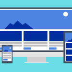
Material UI: Material UI is a React UI framework that embodies the principles of Material Design. It provides a collection of pre-designed, customizable components that enable developers to build beautiful and functional UIs while maintaining consistency and adhering to Material Design guidelines. Material UI’s popularity has soared due to its ease of use and flexibility.
Unveiling the Power of Material UI Theming
Theming for Consistency: One of the standout features of Material UI is its theming system. Theming allows developers to create a consistent visual identity for their applications by customizing colors, typography, and other design elements. This is particularly valuable for branding and creating a unified user experience across different screens and components.
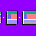
Ease of Customization: Material UI’s theming is not only about adhering to predefined styles. Developers can easily customize themes to align with their unique design visions. Whether it’s adjusting primary and secondary colors, modifying typography, or tweaking spacing, the theming system provides granular control, resulting in UIs that truly stand out.
Responsive Design: In today’s multi-device landscape, responsive design is paramount. Material UI theming integrates responsive design principles, ensuring that UI components adapt gracefully to various screen sizes and orientations. This eliminates the headache of manually handling responsiveness and enhances the user experience on a wide range of devices.
Components That Align with Material Design: Material UI theming offers a treasure trove of components that align seamlessly with Material Design guidelines. From buttons and cards to navigation drawers and modals, these components are not only aesthetically pleasing but also highly functional. They come with built-in interactivity and accessibility considerations, saving developers precious time and effort.
Crafting a Custom Theme with Material UI
Getting Started with Theming: Creating a custom theme in Material UI is a breeze. Developers can start by utilizing the function, which provides a solid foundation to build upon. This function accepts an object containing design properties such as colors, typography, and spacing. With this, developers can define their application’s visual personality.
Color Palette Customization: Colors play a pivotal role in UI design. Material UI theming allows developers to define a color palette that resonates with their brand or design concept. By specifying primary, secondary, and other variant colors, developers can create a harmonious color scheme that evokes the desired emotions and enhances usability.
Typography Tailoring: Typography is another cornerstone of effective design. Material UI theming enables developers to fine-tune typography by selecting appropriate fonts, font sizes, and line heights. This attention to typographic detail contributes to the overall readability and aesthetics of the UI.
Shape and Spacing Consistency: Consistency in shape and spacing is vital for a polished UI. Material UI theming provides tools to define border radii, shadows, and spacing values. These parameters ensure that UI components maintain a cohesive look and feel, elevating the overall user experience.
Optimizing Performance and Accessibility
Performance Considerations: While crafting visually appealing UIs is essential, performance should never be compromised. Material UI theming is optimized for performance, with features such as server-side rendering (SSR) support and lazy loading of components. This ensures that applications remain snappy and responsive, even as the complexity of the UI increases.
Built-in Accessibility: Inclusivity is a fundamental aspect of UI design. Material UI theming embeds accessibility considerations into its components. This means that developers can create UIs that are inherently accessible to users with disabilities, without the need for extensive additional work. This commitment to accessibility aligns with modern design principles and regulatory requirements.
Unlocking Creativity and Innovation with Material UI Theming
Material UI theming is not just a technical tool; it’s a canvas for creativity and innovation. Developers can experiment with different themes, color palettes, and typography combinations to achieve unique aesthetics that resonate with their target audience. Whether it’s a playful and vibrant design or a sleek and minimalist interface, Material UI theming empowers developers to bring their creative visions to life.
Final Words
In the dynamic world of web development, creating stunning and customizable UIs is a goal that every developer aspires to achieve. Material UI theming, rooted in the principles of Material Design, unlocks the potential to craft UIs that not only captivate users but also enhance functionality and accessibility. By harnessing the power of theming, developers can transcend the ordinary and create extraordinary digital experiences that leave a lasting impression.
Commonly Asked Questions
Q1: Can I use Material UI theming with frameworks other than React?
A: Material UI theming is primarily designed for React applications. However, there are community-driven efforts to adapt Material Design principles to other frameworks, so you might find similar theming concepts in those ecosystems.
Q2: How do I handle responsive design with Material UI theming?
A: Material UI theming incorporates responsive design principles by default. UI components are designed to adapt fluidly to different screen sizes. Developers can further customize responsiveness by adjusting breakpoints and layout strategies.
Q3: Is Material UI theming suitable for complex UI projects?
A: Absolutely! Material UI theming is well-suited for both simple and complex UI projects. Its flexibility and customization options make it a valuable asset in crafting intricate and visually appealing interfaces.
Q4: Are there resources for learning more about Material UI theming?
A: Yes, Material UI offers comprehensive documentation and tutorials on their official website. You can explore guides, examples, and best practices to deepen your understanding of Material UI theming.
Q5: Does Material UI theming replace the need for a designer?
A: While Material UI theming empowers developers to create visually appealing UIs, it doesn’t replace the role of a designer. Collaborating with a designer can enhance the overall design quality and user experience of your application.